Standard text height for architectural drawings, sheet by sheet
The standard text height for architectural drawings is chosen from the ISO 3098 series of heights on the paper: 1.8, 2.5, 3.5, 5, 7, 10, 14 and 20 mm. Dimension figures and notes are 2.5 mm on A4 to A2 sheets and 3.5 mm on A1 and A0, and titles go a size or two larger. Nothing under 1.8 mm reads on a plot.
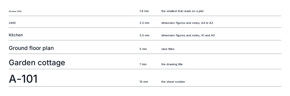
That covers most of what you need. The rest of this page explains why the series has those odd-looking numbers, what each size is for, how the letters inside each height are built, and why 1.8 mm is the floor. The drawing above shows the sizes from 1.8 to 10 mm at their true height on an A3 sheet, with what each one is used for.
The ISO 3098 height series
ISO 3098-1:2015 gives text height as h, the height of a capital letter on the printed sheet. You don't pick any number you like. You pick from this list:
| Height on paper (mm) | Typical use on an architectural sheet |
|---|---|
| 1.8 | The smallest that a plot reads. Use it sparingly, and never for anything a builder must read. |
| 2.5 | Dimension figures and notes on A4 to A2 |
| 3.5 | Notes in general; dimension figures and notes on A1 and A0 |
| 5 | View titles, room names that need to stand out |
| 7 | Drawing titles, larger view titles |
| 10 | The sheet number in the title block |
| 14 | Larger headings where a sheet needs them |
| 20 | The top of the series |
A simple set many offices settle on: dimension figures at 2.5 mm, notes at 3.5 mm, titles at 5 or 7 mm. On a big sheet move everything up one step, so dimensions and notes are 3.5 mm.
Why the steps go up by √2
Each height in the series is the one before it multiplied by √2 (about 1.41). That is not an accident. The A sheet sizes are built on the same ratio, so when you print a sheet one size smaller, every letter shrinks by exactly one step and lands on the next height down. 3.5 mm text on an A2 sheet printed on A3 comes out at 2.5 mm. Still a standard height, still legible.
Line widths follow the same logic, which is why a reduced print keeps its proportions. If you want the full story on that side, see line thickness in technical drawing.
This is also the reason for the 3.5 mm rule on A1 and A0. Architects print full-size sets on A1 and check-sets at half size. An A1 sheet printed on A3 drops two steps (the same reason 1:50 at A1 becomes 1:100 on A3). 3.5 mm drops to 2.5 and then to 1.8. That is the smallest height that still reads, so the half-size print survives. Start at 2.5 mm on an A1 and the half-size print falls below the floor.
The smallest text height that prints
The practical minimum is 1.8 mm on the paper. Below that, a plotted letter stops being a letter. The reason is in how the characters are built: at 1.8 mm, the lower-case letters are only about 1.3 mm tall and the stroke is under 0.2 mm. Ink spreads, toner bleeds, and the small openings in an e or an a close up. A 3 and an 8 start to look alike, which is the last thing you want in a dimension.
Treat 1.8 mm as the bottom of the range, not a target. Keep it for things a reader can live without, like a small reference on a detail. Anything that tells someone what to build, a dimension, a note, a material, wants 2.5 mm or more.
How a letter is built inside its height
ISO 3098 doesn't only fix the capital height. It fixes the proportions around it, so text at every size looks like the same family. For lettering B, the form used in CAD, table 1 of ISO 3098-1:2015 gives:
- Capital height: h
- Lower-case height: 0.7h
- Stroke width: h/10 (lettering A, the narrower form, uses h/14)
- Gap between characters: 0.2h
- Pitch between lines of text: at least 1.4h
Worked through for the most common size, 2.5 mm text:
| Measure | Rule | At h = 2.5 mm |
|---|---|---|
| Lower-case letters | 0.7h | 1.75 mm |
| Stroke (lettering B) | h/10 | 0.25 mm |
| Gap between characters | 0.2h | 0.5 mm |
| Line pitch, minimum | 1.4h | 3.5 mm |
Notice the line pitch for 2.5 mm text is 3.5 mm, the next height up. That is √2 again. Multi-line notes set closer than 1.4h start to run together on a print, so if your note text looks cramped, check the line spacing before you change the height.
Upright or sloped
Upright lettering is the default. Sloped lettering is allowed and leans 15° from vertical (ISO 3098-5 covers CAD lettering). Pick one for the set and stay with it. Mixing the two on one sheet reads as a mistake.
Which way the text faces
ISO 129-1:2018 §7.1 sets two rules that matter as much as the height:
- Text reads from the bottom of the sheet or from the right-hand edge. It is never upside down.
- Text is never crossed by a line. Break the hatch, the grid line or the leader around it.
The second rule catches a lot of plans. A room name sitting on a hatch, or a dimension figure with a wall line through it, is the commonest reason correctly sized text still can't be read. Your text height can be perfect and the note still fail.
Text height on the paper, not in the model
Every figure on this page is a height on the printed sheet. That is the only height that means anything to the person reading the drawing. The trouble starts in model space, where you draw at full size and the text has to be scaled up so it prints at 2.5 mm. At 1:100 that text is a hundred times bigger in the model than on the paper. The sum, the chart, and the ways people get it wrong are on text height for scale 1:100, the companion to this page.
In isogram you skip that sum. Text height is set as the height on the printed sheet, in millimetres, picked from the ISO 3098 series, and the app works out its size on the drawing from the scale. You type 2.5 and it prints at 2.5, whether the view is 1:50 or 1:200.
A quick checklist before you issue
- Every text height is from the series: 1.8, 2.5, 3.5, 5, 7, 10, 14 or 20 mm.
- Dimension figures and notes are 2.5 mm on A4 to A2, 3.5 mm on A1 and A0.
- Titles sit a size or two above the notes.
- Nothing anyone must build from is at 1.8 mm, and nothing at all is under it.
- Multi-line notes have a line pitch of at least 1.4h.
- All text reads from the bottom or the right, and no line runs through it.
- The title block lettering follows the same series. Its fields are covered in the ISO 7200 title block guide, and the frame around it in ISO 5457 sheet borders.
Point 4 is the one that slips through, usually a note copied in from another drawing at another scale. Before a set is issued, isogram reads every sheet for what a senior drafter would catch, and lettering too small to print is one of them, along with an empty title block field and two sheets with one number. If you'd like to try it, the public beta opens in December 2026 on the Mac and Windows, with Linux following in an update, and it is free to test: join the list and the download link comes by email.
Questions
What is the minimum text height on a drawing?
1.8 mm on the printed sheet. Below that, plotted letters fill in and stop being legible, so keep anything a builder must read at 2.5 mm or more.
What is the ISO standard text height?
ISO 3098-1 doesn't fix one height. It gives a series of heights on the paper, 1.8, 2.5, 3.5, 5, 7, 10, 14 and 20 mm, and each step is √2 larger than the last.
What text height should dimensions be on an A1 drawing?
3.5 mm on the paper. On A4 to A2 sheets dimension figures are 2.5 mm; on A1 and A0 they go up one step so a half-size print still reads.
Is the standard text height different for engineering drawings?
Under ISO 3098 the same series of heights applies to architectural and engineering drawings alike. The choice of size for each job follows the sheet size, not the discipline.
How tall should title text be on a drawing?
A size or two above the notes, so 5 or 7 mm on the paper when notes are 3.5 mm. Sheet numbers in the title block are often larger still.
11 November 2026
The public beta opens in December.
Join the list and we'll email you the download link when it opens. It's free to test.
Join the listMore guides
- Hatching in engineering drawing: every rule for a section, and whyHatching in engineering drawing per ISO 128-50: the 45° angle, 2.5 to 4 mm spacing, adjacent parts, thin sections, large areas and text, each with why.
- Tolerance block on drawings: both styles, with a worked example of eachHow a tolerance block on drawings states the general tolerance: an ISO 2768 class or a decimal-places block, with worked examples and when each is used.
- AIA layer standards: how a name is built, the layers you need, and N, E, DHow an AIA (NCS) layer name is built from discipline, major group, minor group and status, the layers an architectural set needs, and -N, -E, -D.
- Drawing revision letters not used: which ones, why, and what comes after ZWhich revision letters drawings skip and why, the full sequence from A to AA and beyond, and how to write a revision row above the title block.
- Text height for scale 1:100: the sum, the chart, and how to stop doing itText height at 1:100 is the paper height times 100: 2.5 mm prints from 250 mm. A chart for every usual scale, and how to skip the sum entirely.
- Line thickness in technical drawing: the ISO widths and why they go up by √2The ISO 128 line widths from 0.13 to 2 mm, why each is √2 times the last, the wide and narrow pair, and which line type takes which width.